
User Experience, Information Architecture, Preliminary UI
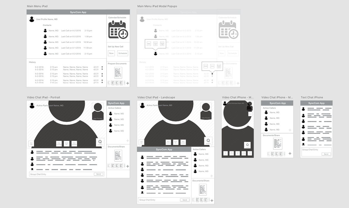
Led the user experience design on an inter-company communications app for brand representatives and medical professionals within the pharmaceutical industry. The initial task was to build a tool that could connect peers and presenters to communicate via video chat. Some specifications were outlined, such as the ability to share documents during a presentation, as well as the type of video sessions that would be required.
We began the design process by researching similar tools and conducting interviews with a selection of potential users to see what tools they were currently using and discover what did and didn’t work with their current solution. A common complaint we found was that although screen sharing and file transfer capability was common, these didn’t quite meet their needs for the types of face-to-face calls they were conducting. The users were comfortable with the technology, but felt friction in switching to screen sharing on a call and the quirks that come with it.
With these findings in hand, I outlined the high-level functionality, as well as the three different user types that would be using the application and created personas to explore the specific goals and scenarios for each type of user. The functionality remained mostly the same, but certain modes such as a broadcast-style presentation mode were only available to certain users.
A key function we included in the application was a solution to the user’s needs for document sharing. Rather than transferring a file or sharing a desktop, files would be prepared in advance (or during a call if necessary) in a slide presentation-style deck that allowed for queuing up the appropriate file and quick display on the screen in a way that allowed them to maintain their confidence in a presentation setting. Functionality for a touch-cursor pointer was also included to aid in the user’s ability to discuss the onscreen content.
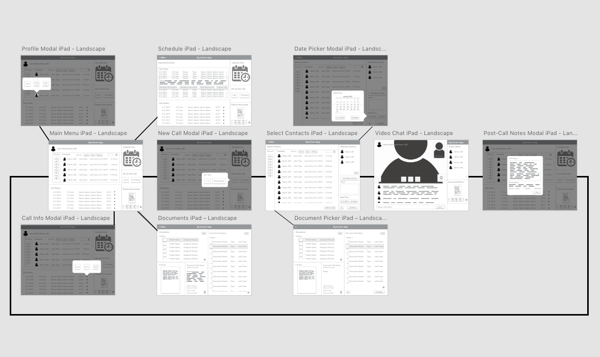
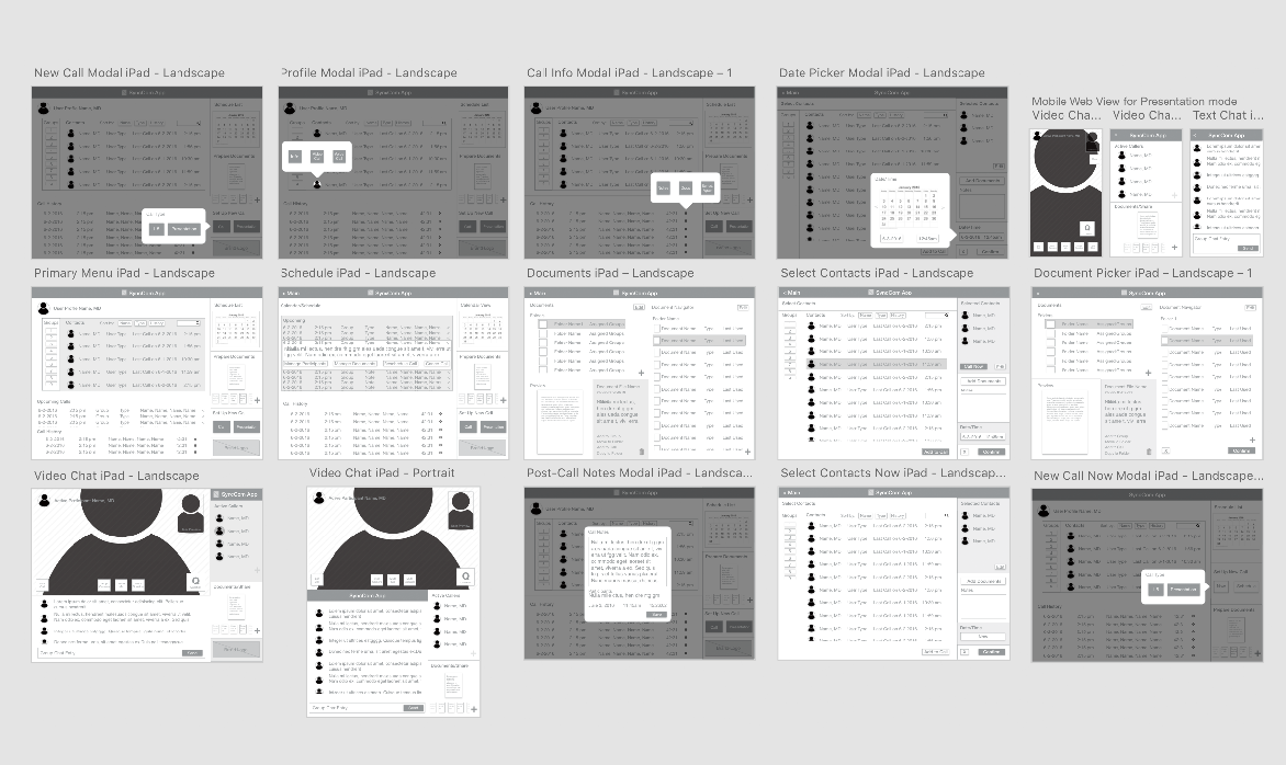
An issue that was discovered in user testing resulted from an edge-case where a user had prepared a large number of resources to present during a call. The bin of documents could become overwhelming when the files were similar (either in thumbnail preview or filename). To solve this, we introduced a simple color-based tagging and sorting system that improved the user’s ability to quickly identify files prepared for different contexts, even in a more common scenario of 3-5 documents per presentation.
The final version of the app would be skinned and branded by an internal design team, but UI guidelines and contrast suggestions were outlined and handed off after our engineering team completed development. Although created to meet a specific client’s needs, considerations in the functionality and interface were made to allow the tool to be rebranded and used to meet the similar needs of other clients.