Patient Educational Resource App
User Experience, Interface Guidelines
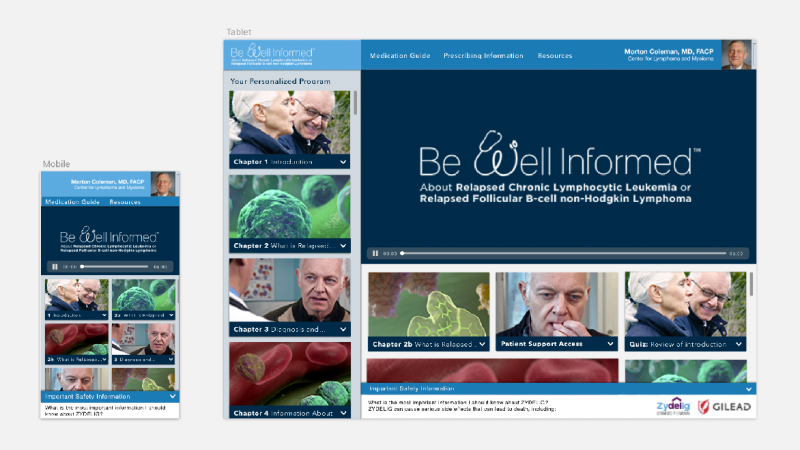
The app is a companion to a personalized DVD and streaming video program available to doctors, produced for a range of conditions and treatment brands. The program is presented to patients as a learning tool to aid in the treatment of specific medical conditions, to supplement in-office explanations, and to improve understanding of their treatment.
The previous patient education app had a dated look with a basic presentation of videos in a list, but needed several improvements to remain viable. In earlier versions of the program, usage metrics had been adequate, but based on survey data, patients preferred the simplicity of the DVD programs and thus retention had a sharp decline after the first few uses. The goal of the redesign was to increase engagement, reporting of feedback, and improve usability for the end-user to increase retention of content involving critical subject matter. Considerations also had to be made for the placement and accessibility of safety information, as many of the programs discuss treatments that require regulated warnings to be accessible at all times.
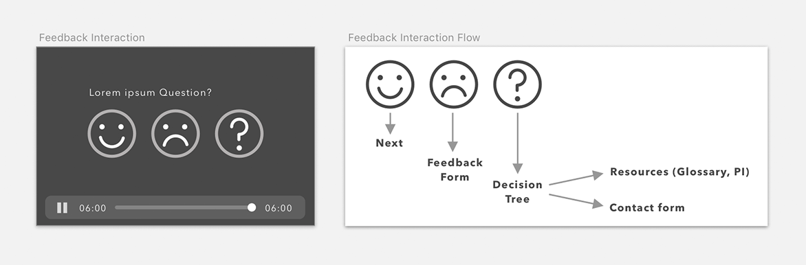
The user and business goals were particularly in alignment on communication of feedback. The original design incorporated a feedback survey that was a holdover from the DVD program, and response rates were very low. I worked with the internal brand managers and copy team to identify the goals of the form and develop a new modular system of gaining insights upon completion of each chapter. This allowed us to break up a daunting list of questions nested under a menu into bite-sized check-ins to give the user an opportunity to share any concerns or questions. In the initial deployment, the amount of usable feedback collected increased significantly, avoiding the all-or-nothing situation of the previous form.
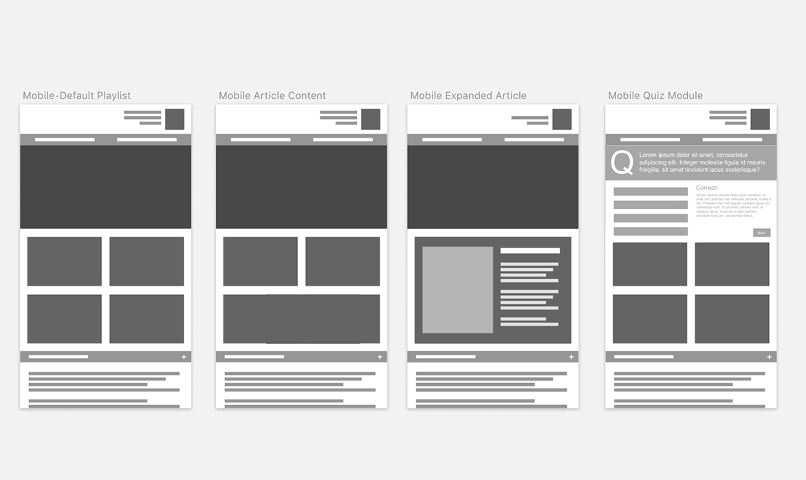
The other main focus of the redesign was to help evolve the product into a platform for more than video content, which would give more opportunities for the user to discover and retain the information in the program. This would also allow for new content to be published beyond the launch date, enabling it to become a more valuable resource and incentivize users to return beyond a single watch-through. I worked with the internal brand team to identify types of content that would be successful and created a system of module-based content blocks that could be interspersed with the video chapters, which went hand-in-hand with the new system of feedback collection. In addition to video, the content modules would also include blog-style articles for healthy living tips and testimonials, as well as interactive quiz modules to measure comprehension of the material.
A test deployment of the app was well-received, and allowed for more granular feedback that would be valuable for the both the video production and content-creation teams. This enabled the application to advance beyond a basic accessory to the DVD program, providing a foundation for the future of the product line.